The BRIT Awards x Mastercard Project
The Brief
In November of 2022, Mastercard sent out a competition to The BRIT School to have the opportunity to highlight students’ work around the O2 Arena and in ITV adverts on the day of the BRIT awards. I worked alongside my friend Nadiya on this project. We were tasked with creating a concept of work surrounding Mastercard’s signature chime. They also requested we used their colours in our work. This could have been any kind of creative concept, from music, to dance, to animation. For this, I chose an animation concept.
THE CHIME
THE COLOURS

Research
We started out by creating a brainstorm of initial thoughts from the chime. Since the brief was vague, there was a lot of room for creative freedom within the project. We initially thought that the chime represented happiness, childhood and calmness, so we wanted to create something surrounding that idea. We then began to research design trends within the year. Three design trends that stood out to us were futurism, geometry and surrealism. We wanted to try and incorporate at least one of these trends into our work.
WHAT IS MASTERCARD?
Mastercard is a payment network processor that partners with many banks and institutions. They have sponsored the BRIT awards for a few years now and also help The BRIT Trust fund The BRIT School. Since they have held this competition before, I wanted to see what previous winners had done and what they all had in common, since I thought that if there were trends in the winner’s work, then we too could use those trends in ours to appeal to Mastercard.
I noticed that most successful videos were short. In the brief, they said we could make our videos anywhere between 10-60 seconds long. Because of this, we purposely made our video 15 seconds. I also noticed in the Design submissions, the winners used their signature colours, which they said were preferable but not required. The winners also had a geometric style to their work, so this further encouraged us to include geometry in our animation. Since this work would be displayed in TV indents and projected on screens and posters, we wanted to make our work look ‘clean’ (we didn’t add any grain or tight patterns) so that the visual would look clear in any form of enlargement.
The Process: Our Ideas and Challenges


HERE ARE OUR FIRST INITIAL SKETCHES:
IDEA ONE:
IDEA TWO:
The first idea was two koi fish animated, which turned into a yin-yang symbol and then faded into animated liquid paint.
The second idea was two koi fish swimming around a futuristic scene, which merged to create the MasterCard logo. These are Nadiya’s sketches.
The ‘koi fish’ is interpreted from the idea of balance, which can also be a double entendre to ‘money balance’ relating to MasterCard (very funny). We chose a futuristic scene because we had researched trending design themes this year and futurism had been one of them. It also fits nicely with our drawing.


Nadiya's background sketch (without koi fish)
My digitalised background sketch
We then digitalised this main drawing. Here we ran into some complications - we weren’t entirely sure how to fit the two concepts together. Do we use both? Do we try and put one over the other?
We soon realised that we could transition one idea into the other. We did this by having the koi fish swim across the screen, covering the background, and then swiping off the page into the second idea.
As I said earlier, the winners all had a ‘clean’ style image of work, so even though I created a digital version in photoshop, I went to Illustrator and created a ‘clean’ version.

'Clean' style version made in Illustrator
I put our animation concept into one video. It was tricky to explain and the project was ambitious, but our storyboard turned out well. I also created our concept to be similarly themed to MasterCard’s proposal.

Final Product


click here to view the whole document:
We submitted our work to MasterCard and received the news that we had been accepted as winners. Nadiya and I then worked closely with the VFX animators to produce our concept and helped it come to life.
The Outcome
Throughout January, all the selected winners for the Mastercard x BRIT awards project worked closely with the video shoot and photoshoot team to produce posters to be displayed around the UK and the O2 Arena, and an ident for the BRIT Awards. This advert was shown on the 11th of February 2023.
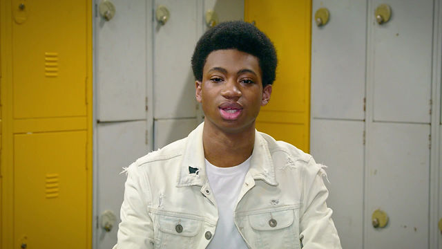
Our group explaining the thought process behind our work and what our work means to us

The advert that was displayed on billboards in various different cities across the UK

The advert that was displayed in the metro
On the Night
OF THE BRIT AWARDS 2023:

The poster that was displayed around the O2
